Nexa Lab Blog – Data visualization is the graphical representation of data to help users better understand and analyze information. It is an important tool in data analysis and decision-making as it allows for patterns, trends, and insights to be easily identified.
Let’s learn more about data visualisation, including its benefits, examples, and the best software for it.
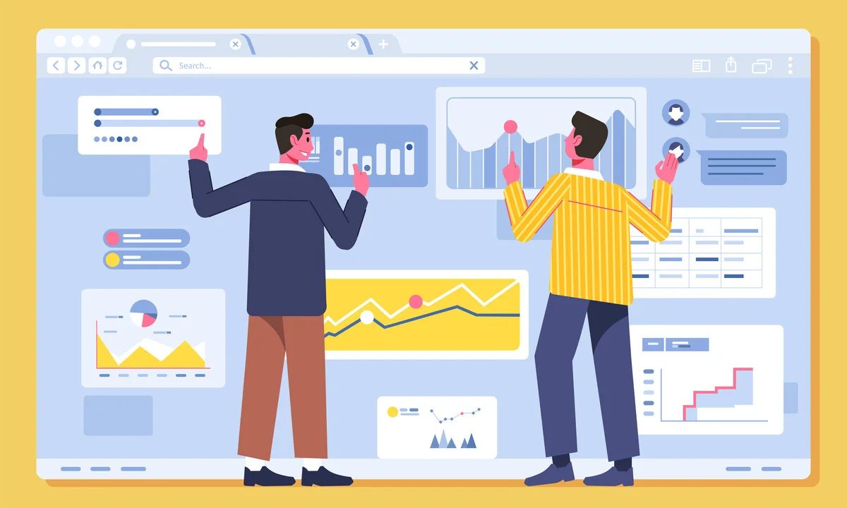
The Definition of Data Visualisation
Data visualisation is the process of translating data into visual representations, such as charts, graphs, maps, or infographics, to help people understand and interpret complex data more easily.
It allows for the identification of patterns, trends, and outliers within a dataset, making it easier to spot relationships and correlations.
Data visualisation is a step in the data science process that requires data to be visualised after it has been collected, processed, and modelled in order to draw conclusions. Data visualisation is also part of the larger data presentation architecture (DPA) discipline, which seeks to identify, locate, manipulate, format, and deliver data in the most efficient manner possible.
Data visualisation can be used in various fields, including business, finance, marketing, education, and healthcare, to facilitate informed decision-making and communicate data-driven insights to a wide range of audiences.
It is an essential tool for data analysts, scientists, and professionals who need to present and communicate complex data in an accessible and understandable manner.
Data visualisation is typically part of a larger data architecture. So, even if you can visualise it as well as you can, it will never work unless you have good data architecture.
Data architecture is the discipline that documents an organisation’s data assets, maps how data flows through its systems, and provides a blueprint for managing data.
Read more about it in our post, ‘Data Architecture: Definitions, Frameworks, and Key Steps’.
Why is Data Visualisation Important?
Data visualisation is a quick and effective way to communicate information in a universal way by utilising visual information.
The practice can also assist businesses in determining which factors influence customer behaviour, identifying areas that require improvement or additional attention, making data more memorable for stakeholders, understanding when and where to place specific products, and predicting sales volumes.
Other than that, TechTarget lists several benefits of data visualisation:
- Help with the ability to absorb information quickly, improve insights, and make faster decisions.
- Provide a better understanding of the next steps needed to improve the organisation.
- Help to maintain the audience’s interest with information they can understand.
- Easier information distribution increases the opportunity to share insights with everyone involved.
- Reducing the need for data scientists with more accessible and understandable data.
- Improve your ability to act on findings quickly, resulting in more success and fewer mistakes.
What Does Data Visualisation Show?
Data visualisation displays a wide range of information and insights, from simple trends to complex relationships within datasets. Visualisations make it easy to identify patterns, correlations, distributions, and anomalies.
For example, in financial analysis, line charts can reveal market trends, whereas heatmaps can identify areas of high and low performance in business operations. Interactive dashboards improve user engagement by enabling real-time data exploration.
Here is some common information that a data visualisation can show:
- Trends and Changes: Data visualisation can show changes over time and trends in data. For example, a line graph can show how a company’s sales have increased over the past year.
- Patterns and Correlations: If there are correlations between different data sets, data visualisation can make them easier to understand. Scatter plots can show how variables are related to each other.
- Distribution: Data visualisation can show how data is distributed. For example, a histogram can show how grades are distributed in a class.
- Outliers: Outliers, or data points that are significantly different from others, can be easily identified with data visualisation.
- Part-to-Whole Relationships: Some types of data visualisation, like pie charts, can show part-to-whole relationships, making it easy to see how individual parts contribute to the whole.
Remember, the type of visualisation used depends on the data set and the specific information that one wants to show. It’s important to choose the right type of visualisation to accurately and effectively present your data.
Tools and Software for Data Visualisation
There are several tools and software available for data visualisation. Tableau and Microsoft Power BI are the popular choices that are used by businesses. However, it is important to note that each software has its own set of advantages and disadvantages.
FounderJar provides a detailed list of the best data visualisation software options for various use cases. Here they are:
- Tableau: Best for creating maps and public-facing visualisations. It provides an enormous collection of data connectors and visualisations.
- Microsoft Power BI: Best for Business Intelligence (BI). It’s a versatile tool that can handle a wide range of data visualisation tasks.
- Google Charts: Best for web-based data visualisation. It’s a powerful tool that allows you to create interactive charts and graphs on the web.
- Qlik Sense: Best for artificial intelligence (AI). It’s a robust tool that uses AI to help you make sense of your data.
- Klipfolio: Best for custom dashboards. It allows you to create custom dashboards to visualise your data.
- Looker: Best for visualisation options. It offers a wide range of visualisation options to help you present your data in the most effective way.
- Zoho Analytics: Best for Zoho users. If you’re already using Zoho for your business, Zoho Analytics can be a great addition to your toolkit.
- Domo: Best for custom apps. It allows you to create custom apps to visualise and interact with your data.
Remember, the best tool for you depends on your specific needs and the nature of your data. It’s always a good idea to try out a few different tools to see which one works best for you.
That’s all you need to know about data visualisation. As part of the overall data management process, data visualisation plays an important role in presenting data to executives. However, you will be unable to visualise it if your data is not secure. One way to keep your company’s data secure is to conduct a risk mitigation process.
In the context of cybersecurity, risk mitigation refers to the process of identifying, assessing, and implementing strategies to reduce the likelihood and impact of cyber threats.
You can read more about it in our previous post, ‘Risk Mitigation: Definitions and Steps to Guard Your Company Data from Cyberattacks’.
Conclusion
Data visualisation shines in the big data era, providing clarity in the midst of the deluge of information. Complexity is reduced to easily understood visuals, enabling people and organisations to gain knowledge and take meaningful action.
Ready to take your data visualisation to the next level?
Nexa Lab Data Visualization and ETL services provide you with cutting-edge data visualisation services that will help you make sense of your data and drive strategic decision-making. We offer the best services for you with interactive dashboards, data integration and aggregation, advanced analytics and forecasting, and automated ETL workflows.
Nexa Lab is a web and application developer that specialises in MSPs (Managed Service Providers) and IT departments. We were born and raised in Australia and have over 30 years of experience in the MSP and IT industries.